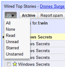
Michael Leggett, Gmail's lead user interface designer, explains how he came up with this widget:
It IS odd. And yet, both the checkbox and the menu part tested very well in the lab. The people who hated the widget outside the lab also understood how to use it but promised others wouldn't b/c it was so "weird."
We tried a few things (like putting the select actions under "More actions") but I didn't have high hopes for any of them except the widget that launched. It tested better than I had hoped (all of the participants in the usability study were able to select all, unread, and none). We launched it to all Googlers months ago and listened to feedback (everyone was able to figure it out... some just hated the change).
More about why the change: The "Select all" link is used by <1% style="font-weight:bold;">I wanted to simplify the interface and give back that space to users.
Since features like "select unread" or "select starred" were used by a lot less than 1% of the users, it made sense to hide them. Power users can always learn how to use keyboard shortcuts and an extra click doesn't mean too much for a feature that's rarely used.
Michael Leggett also says that the link to Buzz will be added at the top of the page, next to Contacts and Tasks, and users will be able to hide the links to service they don't use.
{ via Ignore the Code. Thanks, Jérôme Flipo. }