How Google+ Transformed Picasa Web

Even though it's not obvious, after you enable Google+ in your Google account, Picasa Web turns into a completely new app with a different set of rules. Some of these rules make Google's photo sharing service unusable for many existing users and it's important to know them in advance.

Picasa Web's face recognition feature helped you organize your photos. The integration between Picasa Web and Google Contacts made it easy to associate your photos with some of your contacts. By the default, the name tags from your public albums were hidden, but you could also hide the name tags from unlisted albums. When you join Google+, all of this changes. Adding a name tag to a photo is no longer a private action: your contact will get a notification that you tagged him. He will get access to your photo and to the entire album that includes the photo.

"You'll receive an email letting you know you've been tagged in a photo. By default, name tags by people in your circles are automatically approved. You can view or remove tags at any time on the photos homepage in Google+ as well as the Photos tab on your Google profile," informs Google. Name tags change their visibility too: if you have access to an album, you can see all the name tags from that album. You're not the only one who can add tags to your photos: anyone in your extended network at Google+ (friends and friends of friends) can add tags.

While these changes could improve Google's face recognition software and allow Google to add new social features, transforming Picasa Web's private tagging into Facebook's photo tagging is a radical shift. Sharing an entire album with someone just because you've added a tag is something that might baffle a lot of Picasa Web users who don't realize that Picasa Web is now Google+ Photos.

The good news is that the existing name tags remain unchanged and your contacts won't be able to see your albums just because you've tagged them at some point. But that's true only for the name tags added before joining Google+.


The new version of Picasa Web for Google+ has another drawback: you can't comment on a photo of a Google+ user if you don't have a Google+ account. Even if the photo is included in a public album, it's still not possible to write a comment without joining Google+. The explanation is that "comments on photos are shared across Picasa Web Albums and Google+".

I suspect that joining Google+ will be required if you want to use Picasa Web Albums. As Alexander Kunz noticed, this is similar to an update that required users to link Picasa Web with Google Profiles to be able to add comments or share photos. "I think it's pretty safe to say that qualifies as blackmailing. In the end, the users won: after a storm of protest in the Picasa help forums, the requirement was taken away," says Alexander. It's clear that it was just a temporary victory.


Now when you share an album with your contacts, they're allowed to reshare it with other people, so you can no longer tightly control the visibility of an album without constantly monitoring the access list. Google Docs has a similar rule, but you can change the sharing settings so that "only the owner can change the permissions." Google has an explanation: "to encourage the natural flow of conversation, once you sign up for Google+, all albums can be reshared by people that have access to the album - those people on the album's 'Shared with' list in Picasa Web Albums."

It's worth pointing out that the new Picasa Web adds some benefits (unlimited free storage for photos up to 2048 x 2048 pixels, easier photo sharing) and that you can migrate your photos to a different Google Account, but it's sad to see that Picasa Web is now a Google+ app which no longer works well standalone and that users can no longer use advanced features without sharing their photos.

Preview Gmail's New Interface

Gmail found an interesting way to test the new Google+ interface: using themes. If you go to the Themes page and select "Preview" or "Preview (dense)", you'll be able to try the upcoming Gmail interface. "Why two themes? Our new interface will eventually expand dynamically to accommodate different screen sizes and user preferences, but until then you can pick the information density that you prefer," explains Google.


The new interface uses the same color scheme from Google Maps, Google Calendar and Google Search, the same gray header and blue search button. Since Gmail has two search buttons, Google had to use labels to distinguish between the button that lets you search your message and the Google Search button. The interface is cleaner, since it uses a lot of white space to separate the different sections.

Even if you don't enable the new themes, you'll still see some subtle design changes: many links are now buttons (navigation links, "Back to message list"), the "Refresh" button uses a familiar icon, the "More actions" button changed the label to "More" and Gmail's footer is much cleaner. These are just the first UI updates, so we'll see many other changes until "Preview" becomes the default theme.


Gmail is a complex application and it's difficult to simplify the interface and make it more consistent, especially when you consider the numerous Gmail Labs features and themes. "You can expect some updated themes that embody the same design principles but are better suited to working in a dark environment, use a different color palette, or include the illustrations that we know many of you love to see around your inbox," mentions Gmail's blog.

It should be obvious right now that Google+ is more than a social network or a social layer, it's a Google-wide initiative that affects both the form and the functionality of Google's applications. It's actually a new Google, a social Google that tries to offer cutting-edge apps and a cohesive experience.

{ Thanks, Maarten, James, Yasar, סמנה, Mushaf, Kai, Anthony, Jason, Kartik, David and Karol. }

Google Calendar's Design Refresh

After Google Search and Google Maps, it's time for Google Calendar to switch to a Google+ interface. The new design is a lot cleaner, even if no important feature was removed. "Quick add" is now available if you click the arrow next to the "Create button" (not very intuitive), "Print" and "Refresh" are now buttons instead of links, the month view below the "Create" button can be collapsed, "Save" and "Discard" buttons are only displayed at the top of the page.


"Right now, the changes are just cosmetic and have not affected the way Calendar works. You can choose to turn off the new look by clicking the gear icon and choosing Use the classic look (you can turn it back on by going to the gear icon and choosing Try the new look)," explains Google. Obviously, at some point, Google Calendar will integrate with Google+ and we'll see even more changes.

{ Thanks, Andrew. }

A New Interface for Google Search Results Pages

The latest design refresh updated not only Google's homepage, but also search results pages. Google uses a new color scheme for the sidebar, adds grayscale icons next to the specialized search engines, replaces the standard search button with a label-less blue button, uses a smaller Google logo and adds a gray background color to the header.


Google says it has "muted the color of the tools and reserved the use of bolder colors to highlight key action buttons, tools and filters". Unfortunately, the change made the sidebar icons less useful and the search box too prominent. The new header could pave the way to a search results page that uses "infinite scrolling" instead of pagination.

Here's the old interface:


Can you find other changes?

{ Thanks, Kimnaii, Chris, Swen, Nikita. }

People Widget and Other New Gmail Features

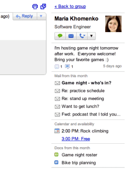
Gmail added a lot of new features lately. The People Widget, announced one month ago, should be available to everyone. The widget shows information about the people you're communicating with: profile photos, occupation, recent Buzz messages, recent email and documents shared with you, calendar availability and more.


If you already use Rapportive, you need to disable the extension to see the People Widget. You can also disable the People Widget from the settings page. Rapportive has more data sources than Gmail's widget: Twitter, Facebook, LinkedIn, FriendFeed, Google Profiles, so you may find it more useful.

The action bar is displayed at the top of the page even when you scroll down, so you can quickly archive a conversation, label it or read the next conversation without scrolling to the bottom of the page or using keyboard shortcuts. A similar feature is available in Gmail's app for Android.


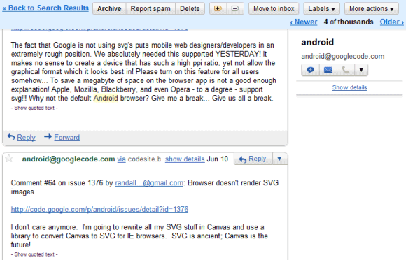
As you can see in the screenshot above, Gmail now shows additional information next to the sender's name to help you protect against email spoofing. When you receive a message from some who isn't in your address book, Gmail will show the email address next to the name. If a website sends an email on behalf of someone, Gmail adds "via domain.com" next to the email address so that you know that the message wasn't sent directly. Gmail uses email authentication to verify the source of the messages you receive, but this data was only used to detect spam and phishing. Now Gmail also shows a warning which informs you that "this message may not have sent" from the email address that appears in the "from" header.


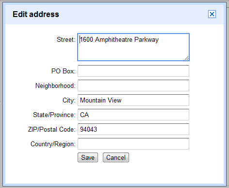
Google Contacts learned a thing or two about structured addresses and it now allows users to separately list the street name, the city, state and postal code. Google tries to split the address automatically, but the results aren't great all the time. Just click "details" next to the address and a new pane lets you edit address fields:


{ Thanks, Steren, Bogdan, Sean, Alex, Vasu and Amit. }

More Free Storage in Picasa Web for Google+ Users

Picasa Web Albums offers more free storage if you are a Google+ user. According to Picasa Web's help center, "photos up to 2048 x 2048 pixels and videos up to 15 minutes won't count towards your free storage". If you upload photos from Google+, they're automatically resized to 2048 pixels on their longest edge, so they don't use the 1 GB of free storage that's available in Picasa Web Albums.


Most people can't use Google+ because it's invitation-only, so the current rules still apply to them: only the photos up to 800 x 800 won't count towards their free storage quota.

Like Google Buzz, Google+ uses Picasa Web Albums to store photos. You can upload photos from the Google+ interface and even automatically upload the photos taken with your Android phone. Google+ lets you add captions and name tags to your photos, rotate them and apply different filters using the built-in image editor. Now your friends can tag your photos and you'll receive a notification when someone tags you in a photo. The downside is that "tagging a person in one of your photos in Picasa Web Albums or Google+ will share the album with the person tagged".

{ Thanks, Калоян. }

The Google+ Bar

A page from the Google+ help center explains the purpose of the new Google navigation bar:


The Google+ bar, which appears at the top of Google products, is your connection to Google+. You can share what's on your mind, view your Google+ notifications, access your profile, or jump to a variety of other Google products. For instance, to get to Google+, all you have to do is click +[your first name].

When you're signed in and look at the Google+ bar, you'll see your full name or email address displayed with a photo or avatar next to it. This helps you identify which account you're currently signed in to. You can sign in to multiple accounts at once and switch between them using the Google+ bar.

One of the most interesting feature of the bar is notifications:
When you receive a notification, the notification area in the Google+ bar will turn red and show the number of new notifications. If you click the notification area in the Google+ bar, you’ll see a summary of your recent notifications. When you click a notification, a preview of the event that generated the notification will appear in the drop-down menu. You can take action on each notification right from the notifications menu, like commenting on a post or adding someone to a circle.

The navigation bar has been morphed into the Google+ bar and it should be more useful. Maybe at some point the bar will include notifications for Gmail, Calendar, Google Docs and other Google services.

Google Takeout

Google wants to differentiate from Facebook by offering a lot of ways to export your data. Google Takeout is a feature that's included in Google+, but it's also available as a standalone service. You can use it to export your contacts, Google Buzz messages, Picasa Web photos and Profile data with one click.

"Google Takeout lets you take your data out of multiple Google products in one fell swoop. Moreover, you’ll find that all your data is in portable and open formats‚ so it's easy to import to other services quickly," mentions the Data Liberation blog.


I've downloaded my data in a huge ZIP archive that included all my Buzz posts saved as HTML files, VCF files for my Gmail groups and the first 100 photos from each of my Picasa Web album. What's the point of downloading the first 100 photos?

Google Swiffy Converts Flash to HTML5

Google Labs has a new useful tool for developers: Swiffy. The application allows you to convert Flash SWF files to HTML5, so you can use any supported modern browser to load the content, even if the browser happens to be Mobile Safari. "Swiffy currently supports a subset of SWF 8 and ActionScript 2.0, and the output works in all Webkit browsers such as Chrome and Mobile Safari."

Google's gallery includes two ads and two simple games that look pretty well when converted to HTML5, especially when you're using Chrome.


Swiffy uses some SVG features that are only available in WebKit browsers, so that's the reason why you can only use it in Chrome and Safari. Android's browser for smartphones doesn't support SVG and it's likely that the Android 3 implementation doesn't support the required features.

"A SWF file is converted in two phases: the Swiffy compiler (which you can use on this website) processes the SWF file and generates a JSON file. A client-side JavaScript runtime loads that JSON file and renders it using HTML, SVG and CSS. Swiffy supports many common SWF features such as vector graphics, embedded fonts, images and timeline animation. Basic ActionScript 2.0 code is also supported, but don't expect to convert your favorite Flash game yet. In general, Swiffy supports most of the features in Flash 5, so exporting your file as a Flash 5 will give the best results," explains Google.

Unfortunately, the code generated by Google is difficult to edit, so you still have to go back to the original Flash file. Adobe has its own tool for converting FLA files to HTML5.

More About Google+ Hangouts

Google's Justin Uberti has more information about Hangouts, the video conferencing app that will be available in Google+.


To support Hangouts, we built an all-new standards-based cloud video conferencing platform. This platform combines high quality, low latency, and strong security with the ease of use of a web application. Through the efficiency of this new platform, we're able to deliver a leading video conferencing experience at Google scale.

A few noteworthy technical points:
* Fully browser-based/cloud-based
* Client-server: leverages the power of Google's infrastructure
* Designed for low latency (< 100 ms) and high performance (multicore + hardware acceleration)
* Standards-based: XMPP, Jingle, RTP, ICE, STUN, SRTP
* Fully encrypted (HTTPS + SRTP)

Hangouts require the same plugin that's currently used for voice and video chat, it's limited to 10 participants and doesn't work on mobile devices yet. Another interesting thing is that "hangouts are created by one person, but everyone in the hangout shares the ability to invite others. Each hangout has a specific URL. That URL can be shared as a link to invite others." You can also use Hangout to watch a YouTube video with your friends.

Hangout looks like a great Google Talk feature and I don't see why it shouldn't be added to Gmail and to Google Apps. Video conferencing could make Google Apps a lot more useful.

Google's New Interfaces

After many weeks of testing, Google finally updated the homepage and search results pages. The changes aren't so radical, but they're still significant: there's a black navigation bar, two updated buttons for "Google Search" and "I'm Feeling Lucky", while the corporate links are moved to the bottom of the page.


Google says that this is just a small step from a redesign that will affect many other services. "The new Google experience that we've begun working toward is founded on three key design principles: focus, elasticity and effortlessness. (...) With the design changes in the coming weeks and months, we're bringing forward the stuff that matters to you and getting all the other clutter out of your way. Even simple changes, like using bolder colors for actionable buttons or hiding navigation buttons until they're actually needed, can help you better focus on only what you need at the moment."

The new navigation bar seems to draw unnecessary attention and some find it distracting, so it's not clear how it helps you "better focus on only what you need at the moment". Google's black bar is used in Google+, so it's likely that it will include other social features in the future.

Google also says that new design is flexible so that it can be used in the desktop interface, the smartphone interface, the tablet interface and even the interface for smart TVs. "The new design will soon allow you to seamlessly transition from one device to another and have a consistent visual experience." At the moment, I'm seeing a new mobile interface that doesn't have too much in common with the desktop interface:


While the interface continues to be simple and utilitarian, Google wants to use HTML5, WebGL and other new technologies to make Google's apps more powerful and better looking. "Our design philosophy is to combine power with simplicity. We want to keep our look simple and clean, but behind the seemingly simple design, use new technologies like HTML5, WebGL and the latest, fastest browsers to make sure you have all the power of the web behind you," explains Google.

Google promises to improve the user interface in Gmail in the coming months, but I think that many other apps will be redesigned and the main goal is to integrate with Google+. If you want a preview of Google's new interfaces, take a look at the Google+ project. Here's, for example, the new Google Maps design:


It's interesting to see that Google Maps added the label-less blue button from Google+, but Google Search still uses the regular button.

{ Thanks, Nikita. }

The Google+ Project

Google revealed some details about the project that will make Google more social. It's called Google+ and it's an extension of the existing Google Profiles and Buzz, with many new features that make sharing more useful. Google's plan to compete with Facebook is to bring "the subtlety and substance of real-world interactions" to the Web.


Google+ means "Google + You", so it's all about your friends, your photos and videos, your interests and your conversations. The service introduces circles, a way to group your friends and share content with the right people. "Today's online services turn friendship into fast food—wrapping everyone in 'friend' paper — and sharing really suffers. From close family to foodies, we found that people already use real-life circles to express themselves, and to share with precisely the right folks. So we did the only thing that made sense: we brought Circles to software. Just make a circle, add your people, and share what's new."


To help you share content with your "circles" of friends, Google added an app called Sparks that shows interesting new Web pages related to your interests. It's like a feed reader that has a list of tags instead of subscriptions, so it's much easier to set up. "The web, of course, is filled with great content — from timely articles to vibrant photos to funny videos. And great content can lead to great conversations. We noticed, however, that it's still too hard to find and share the things we care about— not without lots of work, and lots of noise. So, we built an online sharing engine called Sparks. Thanks to Google's web expertise, Sparks delivers a feed of highly contagious content from across the Internet. On any topic you want, in over 40 languages. Simply add your interests, and you'll always have something to watch, read and share."


Google+ also comes with an online video conferencing tool called Hangouts. It's just like Google Talk, except that you can add multiple people and they can join the "chat room" without being invited. "With Google+ we wanted to make on-screen gatherings fun, fluid and serendipitous, so we created Hangouts. By combining the casual meetup with live multi-person video, Hangouts lets you stop by when you're free, and spend time with your Circles," explains Google.

Google's social networks is also available on your mobile phone using a dedicated Android app and an upcoming iPhone app. The mobile experience is all about location, photos and conversations. You can add your location to all your posts, share the photos from your phone's camera album immediately after they're created and chat with your friends using Huddle.


Google+ requires an invitation, but you can't get one right now. "We're testing with a small number of people, but it won't be long before the Google+ project is ready for everyone," explains Google.

The black navigation bar that's tested right now in Google's search results pages is all about Google+. Here's how the navigation bar will look:


After years of missing the value of social networking, Google tries to catch up with Facebook and show that it can still create amazing products. Google+ will be the first tab from Google's homepage and it will get a lot of exposure, but not many people associate Google with social products. Google will probably have to redesign many of its services and make Google+ a central part of the Google experience, which means that Google will change a lot in the coming months.


{ Thanks, Gorilla. }

FTC's Google Probe

Google confirmed that the U.S. Federal Trade Commission has began a review of Google's business practices after many companies complained that Google used its dominance in the search market unfairly. "Those companies said that Google's anticompetitive practices include using other companies' content without their permission, deceptive display of search results, manipulation of search results to favor Google's products, and buying up competitive threats to its dominance," informs the Wall Street Journal. "The widely trailed investigation is the most significant in Google's 12-year history, on a par with the lengthy Department of Justice probe into Microsoft, which led to tighter regulation and from which the technology giant's image has never fully recovered," writes the Guardian.

Google says that this review is similar to the European Commission review. Last year, the European Commission notified Google that it has received complaints from three companies who claim that Google imposes unfair penalties on competing sites and uses Universal Search as an opportunity to promote its own services. Google argues that it's not a monopoly in search as "the cost of switching to a different search engine is zero". Google also says that its results are "a type of mathematically-derived opinion" and that Google was built for consumers, not websites.

"Search is much different than a utility. With you electricity provider, your telephone provider and your cable provider, there’s generally one cable coming into your home, and you have only one or two choices about which provider to pay for services. With the Internet, web services are only a click away. Google is like a GPS to the Internet – a helpful guide, but not necessary if you know where you're going," explains Google.

The cost of switching to a different search engine is certainly not zero. Google's brand is very powerful and for some people it's synonymous with search. It's also difficult to use another search engine that has a different interface, other features and doesn't know too much about you. Google is the default search engine in all important browsers, except Internet Explorer and Chrome, which doesn't have a default search engine.

Danny Sullivan says that Google's first real antitrust challenge started after announcing the intention to acquire DoubleClick, back in 2007. The likelihood of an antitrust suit made Google change its mind about the Yahoo search deal. Google barely managed to convince the FTC that it's OK to buy AdMob and the ITA acquisition has a lot of strings attached.

Google will continue to have a difficult time acquiring big companies and even startups, while the long list of investigations and lawsuits could slow Google down.

Gmail's New Inbox Styles

Gmail's Priority Inbox is an advanced version of the regular inbox, with customizable sections for power users. For some people, Priority Inbox looked intimidating, so that's probably the reason why Gmail tests a new version of the regular inbox that integrates Priority Inbox and three lightweight versions of the Priority Inbox.

"Try out all the new inbox styles to see what fits you best. You can always switch back if you change your mind," informs a Gmail promotional box. There are five inbox types: classic, important first, unread first, starred first and Priority Inbox. The three new inbox types could easily be obtained by customizing Priority Inbox, but it's much easier to switch between them. It's the first time when Google uses tabs in Gmail interface if you exclude Gmail's settings page.


{ Thanks, Hugh and Evan. }

A New Google Homepage Experiment

Another day, another Google experiment. This time, Google tests a new design for the homepage that combines two experimental features that have already been used (the black navigation bar and the blue search button) with a new way to display the links to Google's corporate pages: at the bottom of the page.


Google has been testing a lot of UI changes for the homepage and the search results pages and it's obvious that some of them will be included in a new interface that will be released soon. Google does away with many traditional features (the "I'm Feeling Lucky" button could be removed from the homepage, the link to the cached version of a search result could be hidden, while snippet URLs could be replaced by the name of the site) and tries to emphasize the navigation bar, which is likely to include new social features.

{ Thanks, Riccardo and Pascal. }

Find Similar Images from a Site

Google Image Search has a nifty feature that was added a couple of months ago, but it's not so easy to find. If you restrict the results to a site and click "similar" next to one of the images, Google will only show similar images from that site. For example, if you search for [paris site:wikipedia.org] and click "similar" next to a photo of the Eiffel Tour, Google will show pictures of the Eiffel Tour and other similar monuments from Paris, but only if they are included in a Wikipedia page.


It's a great way to explore a site and group related images when it's difficult to type a precise query. The top results provided by the Similar Images feature are much better than the results for [monuments in Paris site:wikipedia.org], where you can find maps, flags, logos.


It's important to note that Google Image Search's site: operator no longer takes into account the URL of the image, so if a blog includes an image from Flickr, you'll still be able to find the image when you restrict the image results to the blog's domain or subdomain. "In the past, the [site:] operator filtered based on the image URL, not based on the URL of web pages linking to the images. Now, the operator will run your search over web sites that include images, no matter where the images themselves are hosted, which removes a lot of noise from your results and gives you more control over what you're searching for."

Labels

Web Search Gmail Google Docs Mobile YouTube Google Maps Google Chrome User interface Tips iGoogle Social Google Reader Traffic Making Devices cpp programming Ads Image Search Google Calendar tips dan trik Google Video Google Translate web programming Picasa Web Albums Blogger Google News Google Earth Yahoo Android Google Talk Google Plus Greasemonkey Security software download info Firefox extensions Google Toolbar Software OneBox Google Apps Google Suggest SEO Traffic tips Book Search API Acquisitions InOut Visualization Web Design Method for Getting Ultimate Traffic Webmasters Google Desktop How to Blogging Music Nostalgia orkut Google Chrome OS Google Contacts Google Notebook SQL programming Google Local Make Money Windows Live GDrive Google Gears April Fools Day Google Analytics Google Co-op visual basic Knowledge java programming Google Checkout Google Instant Google Bookmarks Google Phone Google Trends Web History mp3 download Easter Egg Google Profiles Blog Search Google Buzz Google Services Site Map for Ur Site game download games trick Google Pack Spam cerita hidup Picasa Product's Marketing Universal Search FeedBurner Google Groups Month in review Twitter Traffic AJAX Search Google Dictionary Google Sites Google Update Page Creator Game Google Finance Google Goggles Google Music file download Annoyances Froogle Google Base Google Latitude Google Voice Google Wave Google Health Google Scholar PlusBox SearchMash teknologi unik video download windows Facebook Traffic Social Media Marketing Yahoo Pipes Google Play Google Promos Google TV SketchUp WEB Domain WWW World Wide Service chord Improve Adsence Earning jurnalistik sistem operasi AdWords Traffic App Designing Tips and Tricks WEB Hosting linux How to Get Hosting Linux Kernel WEB Errors Writing Content award business communication ubuntu unik