Showing posts with label User interface. Show all posts

New Interface for the Google Q&A OneBox

Google's OneBox for instant answers has a new interface that emphasizes the results. Google now displays the answer on the first line and the font size is bigger.


The Q&A OneBox now shows multiple answers for questions like [What is the cast of The Help?] or queries like [the dictator actors].


Until now, Google used the following template: "Best guess for ... is ...".


Just because Google no longer mentions that the answer is a "guess" doesn't mean that it's always accurate.


Google Tests a New Interface for Info Panes

Last year, Google started to test a new sidebar that offers useful information about your query. As the Wall Street Journal mentioned in a recent article, Google will soon "present more facts and direct answers to queries at the top of the search-results page". There's a large database of entities and each one has a list of relevant attributes.

For example, you could search for [California] and Google displays the capital of the US state, a list of important cities, attractions, the Secretary of State, a map and a snippet from Wikipedia. Google continues to test the info panes, but the interface has been updated, the main thumbnail is smaller and there's more information that's displayed. For singers, Google displays a long list of songs and some important albums.


Google's experimental sidebar is similar to Wikipedia's infobox, "a fixed-format table designed to be added to the top right-hand corner of articles to consistently present a summary of some unifying aspect that the articles share and sometimes to improve navigation to other interrelated articles". It includes structured information about your query, related queries and links to all the topics that are mentioned. Google will look more like an encyclopedia.

{ Thanks, Anirban. }

Google Experiments With a Collapsible Search Sidebar

Google tests a new search interface that hides the options from the sidebar by default. You need to click a small arrow icon to see the list of specialized search engines and some advanced search options that let you filter results.

Essentially, this experiment hides the sidebar's content, but the sidebar still takes up space. Back in 2009, the sidebar was hidden by default and Google made it more visible one year later.

Now that the navigation bar no longer includes many specialized search engines, it doesn't make sense to hide the sidebar. Another issue is that the sidebar highlights advanced options that are relevant to your query, but few people will find them if the sidebar is collapsed by default.


{ via Websonic. Thanks, Akos. }

Customize Gmail's Buttons: Replace Icons With Text

If you don't like that the new Gmail interface replaced most text labels from buttons with icons, there's an option that lets you disable this tweak. Just go to Gmail's settings page, select "text" in the "button labels" section and click "save changes".

Before:


After:


"Icons brought consistency across languages and solved problems with functions that had long names. Some people loved the new icons. Others, especially low vision users, found words easier to distinguish," says Google.

My main issue is that some of the Gmail icons aren't very helpful. For example, it's not obvious that the exclamation mark is an icon for reporting messages as spam. The icons are also small and monochromatic.

{ Thanks, Sterling. }

New Google +1 Buttons

The ubiquitous +1 buttons will soon have a new look. The updated version is available when you subscribe to the Google+ Platform Preview, at least for now.

"Following in the footsteps of our new red and white Google+ icon, the +1 button is sporting a fresh coat of paint," informs Google.


While the new buttons are more consistent and include the Google+ branding, the old buttons are more colorful and more descriptive. "+1" is bigger and more obvious in the old buttons and that made them more clickable.

Here's the tiny +1 button from Google+:


... and here's the +1 button from Google Groups:


The small +1 buttons are not legible and it's not obvious that you're supposed to click them. As Fernando Fonseca says, "I understand the need to have a button that looks like the new logo but the problem is that a white background with a thin red line is hardly eye catching and hardly says 'Click me'."

You can compare the different versions of the +1 (v1) and +1 (v2) using the corresponding sprites. I'd choose the old buttons.

Update: There's still time to improve the buttons. Share your feedback here and here.

{ Thanks, Yu-Hsuan Lin. }

Gmail's New Loading Screen

Sometimes little things can make a difference. Gmail's updated loading screen makes Google's mail service look more like a native app and the transition to the actual interface is much smoother. The progress bar and the "loading" message are now centered and no longer look like an afterthought.


In the new Gmail interface you'll also see the loading page when you pick a different theme and that's annoying.

If you have a slow internet connection, you can enable the "inbox preview" lab feature to see a preview of the inbox while you wait for Gmail to load.

{ Thanks, Herin, James, John and Jonah. }

A Strange Google Mobile Experiment

Sometimes it's difficult to understand Google. A few weeks after dropping the non-obvious navigation menu from the desktop UI, Google tests a new mobile interface that uses the same menu.


Cascading menus on a mobile device? They're too large and many Google services are missing (Reader, Blog Search, iGoogle, Product Search, Google Finance, Picasa Web, Google Talk, Google Tasks), not to mention that there's no room for displaying Google+ notifications.

Back to the Black Bar

Google admitted that the navigation UI launched last year wasn't good enough and brought back the black bar (the color is actually dark gray). Some of the features from the old interface are still available: the list of services, the notification and sharing boxes, the settings menu.

"The new design retains many of the feature changes we made in November that proved popular, including a unified search box and Google+ sharing and notifications across Google. The biggest change is that we’ve replaced the drop-down Google menu with a consistent and expanded set of links running across the top of the page," explains Google.


The black bar doesn't look that great in Google's redesigned interfaces, but it's more functional than the "invisible" menu hidden behind the Google logo. It's always a bad idea to hide important navigational features, even if they clutter the interface. When you have to explain basic features because they're not obvious, you've already failed:


{ Thanks, Cougar and Matan. }

Google Tests a New Version of the Black Bar

While Google hasn't abandoned the navigation bar launched last year, both the old and the new interface are used today. If you load google.com in Chrome's incognito mode, the old interface shows up more often than the new UI. The simplified interface made navigation more complicated, even if it looks better than the black bar.

Google even tests a slightly updated version of the old bar that uses the services from the new UI, more spacing and a different color scheme.
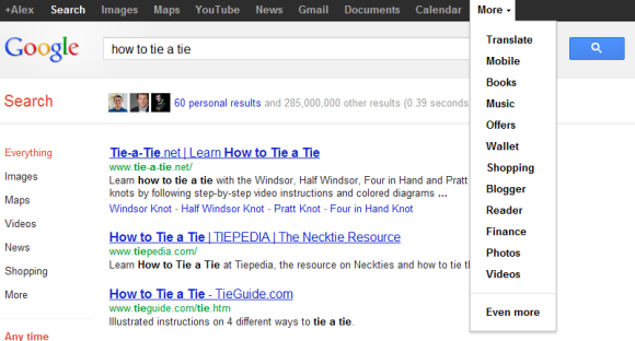
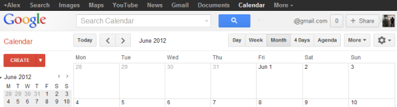

Here's how you can try the latest Google experiment. If you use Chrome, Firefox, Safari or Internet Explorer 8+, open google.com in a new tab, load:

* Chrome's JavaScript console (Ctrl+Shift+J)
* Firefox's Web Console (Ctrl+Shift+K)
* Safari's Web Inspector (how to do that?)
or
* IE's Developer Tools (press F12 and select the "console" tab)

and paste the following code:

document.cookie="PREF=ID=381502750b6e9119:U=aaee74aefea7315a:FF=0:LD=en:CR=2:TM=1328391998:LM=1328392000:S=yPtlCgLbEnezu5b4; path=/; domain=.google.com";window.location.reload();

Then press Enter and close the console. If you're not in the US and you're using a different Google domain, replace ".google.com" with your domain in the code (for example: ".google.co.uk" in the UK).

If you'd like to go back to the old interface and reset the Google PREF cookie, repeat the same steps, but use the following code:

document.cookie="PREF=; path=/; domain=.google.com";window.location.reload();

Google Groups Themes

Just in case you don't like the Google Groups interface and want to customize it, there's a new light gray theme you can try. Just click the settings button, click "Themes" and select the "soft gray" theme. This only works in the new Google Groups interface.


A similar theme is also available for Gmail and it will be interesting to see if Google Groups will add support for the other Gmail themes. Maybe apps like Google+, Google Docs, Google Reader and even services like Google Search will support Gmail's color themes.

{ Thanks , Herin. }

The Story Behind Gmail's Logo

If you've ever wondered who designed Gmail's logo, Kevin Fox has the answer:
Dennis Hwang designed the Gmail logo. At the time, Dennis designed virtually all of the Google doodles and he did a lot of the new logo work as well.

The logo was designed literally the night before the product launched. We were up very late and Sergey and I went down to his cube to watch him make it.

The initial version used the same font as the Google logo (Catull), but Catull has a very awkward 'a', so Dennis decided to use Catull for the 'G' to tie the brand to Google, then cast the others in a cleaner sans-serif (Myriad Pro, if I recall correctly).

Another ex-Googler, Douglas Edwards, confirms the story in his book "I'm Feeling Lucky: The Confessions of Google Employee Number 59":

Dennis Hwang spent the day before the launch coming up with ideas for a logo and trying to make it work in conjunction with the clown-colored Google brand. (...) Even after four years at Google, I found it astounding that one twenty-something guy was sitting alone at his desk, sipping tea and developing the main branding element for a product to be used by millions of people - the night before it was scheduled to launch.

A New iGoogle Interface

Google tests a new interface for iGoogle, the personalized homepage that lets you add gadgets and themes. The updated interface uses the design patterns that should be familiar by now from other Google services. Tabs are now available in a dropdown that's displayed below the search box, while the left sidebar is only used for the chat widget. There are two buttons for adding gadgets and changing the theme next to the options menu.


{ Thanks, Brinke. }

Google's Black Navigation Bar Is Back

Google's attempt to simplify the navigation bar wasn't very successful. The menu released six weeks ago is no longer available and it has been replaced with the old black navigation bar.


I tried to see if it was just a temporary bug, but almost all the browsers I tested displayed the black navigation bar. The only browser that still displayed the menu was Chrome, but that was no longer case after clearing the cookies.

Google indirectly confirmed this change two days ago, when the screenshots from a Google blog post included the old bar.

Sometimes, when you try to simplify things, you end up making them more complicated. Navigation elements should be obvious and hiding them in a menu doesn't make them easy to find. The huge menu took more space than the navigation bar and made the homepage less attractive. Hopefully, Google will fix the navigation interface and release a better version.

YouTube Tests Google+ Integration

Now that YouTube uses Google Accounts, Google can easily integrate YouTube with other Google services. The latest YouTube redesign made the integration with social networks more prominent and the videos from Google+ are just one click away.

YouTube now tests the header that's already displayed in Google Search, Gmail, Google Docs and many other Google services. The header shows your Google+ notifications, a box that lets you share videos with other Google+ users and links related to your Google profile.


Right now, the Google+ header is only displayed if you haven't created a YouTube account and you log in using your Google account (so you don't have a YouTube username and channel). Obviously, you need to join Google+ to see the new features.

{ Thanks, Michael. }

The Google News Search Box

The Google News homepage uses a special search box with a few interesting features. Google only shows a list of suggestions and doesn't use Google Instant, even if this feature is available for the Google News results pages. The last suggestion lets you search the web and you can use the up arrow key to select it or just press Shift+Enter. A similar feature is available in Gmail, but you can't use the Shift+Enter shortcut.


When Google redesigned Google News and other services, the "Web Search" button seemed extraneous and it was removed.

Updated Interface for Google Bookmarks

After removing the lists feature, Google Bookmarks updated the interface to match all the other Google services. It's nice to see that Google Bookmarks still exists, but the service only integrates with Google Web History and Google Toolbar for Internet Explorer. The integration with Google search has been removed, now that Google focuses on Google+, and the Android ICS browser uses the bookmark sync service from Chrome.

Google will have to find a way to merge Google Bookmarks with Chrome's bookmark sync. Google Toolbar could show the bookmarks saved in Chrome, while Google Bookmarks could be a web interface for Chrome's bookmarks. Unfortunately, Chrome uses folders, while Google Bookmarks uses labels, so merging the bookmarks is not an easy task.

No More Cosmic Panda

When YouTube launched the new interface, it was obvious that Cosmic Panda was just an experiment and its purpose was to test some new features. Now Cosmic Panda is no longer available and users have been switched to the regular interface.

"Yesterday marked the last day of the channels and watch experiment, otherwise known as Cosmic Panda. Contrary to what some might have thought, Cosmic Panda was not the new version of YouTube to come, but just an experiment we used to test out some new and interesting ideas. Since launching the experiment in July, we learned a lot and incorporated many results of the experiment into our recent homepage and channels update, which you're using now. We're happy with what we found and are now bringing Cosmic Panda to a close," informed a Google employee.

Google Mobile Search Increases Text Size

Google Mobile Search increased the text size for search results and reduced the number of words from the snippets. While this change made search results more legible, it also reduced the number of results that are displayed before you start scrolling.

On an iPhone, Google only displays two results in their entirety, instead of three results, and the snippets are way too short.

Old UI:


New UI:

Google Search Pages Hide +1 Buttons

+1 buttons no longer clutter Google's search results pages. They're now displayed when you mouse over the results for most of the pages. If you have +1'd a page, the button will be displayed by default to highlight the result.


In other search-related news, the preferences page has a new interface with custom controls, while the advanced search page switched back to the old interface. Maybe someone read this post and decided to fix the drop-down lists.


Google Image Search Tests a New Tablet Interface

Google tests a new tablet interface for the image search engine. The new UI uses a carousel that lets you browse through the image results, just like the search app for iPad. Google no longer loads the corresponding websites and only focuses on the images.


A similar slideshow is available in the smartphone interface and it will be interesting to see if it will be added to the desktop interface.

Labels

Web Search Gmail Google Docs Mobile YouTube Google Maps Google Chrome User interface Tips iGoogle Social Google Reader Traffic Making Devices cpp programming Ads Image Search Google Calendar tips dan trik Google Video Google Translate web programming Picasa Web Albums Blogger Google News Google Earth Yahoo Android Google Talk Google Plus Greasemonkey Security software download info Firefox extensions Google Toolbar Software OneBox Google Apps Google Suggest SEO Traffic tips Book Search API Acquisitions InOut Visualization Web Design Method for Getting Ultimate Traffic Webmasters Google Desktop How to Blogging Music Nostalgia orkut Google Chrome OS Google Contacts Google Notebook SQL programming Google Local Make Money Windows Live GDrive Google Gears April Fools Day Google Analytics Google Co-op visual basic Knowledge java programming Google Checkout Google Instant Google Bookmarks Google Phone Google Trends Web History mp3 download Easter Egg Google Profiles Blog Search Google Buzz Google Services Site Map for Ur Site game download games trick Google Pack Spam cerita hidup Picasa Product's Marketing Universal Search FeedBurner Google Groups Month in review Twitter Traffic AJAX Search Google Dictionary Google Sites Google Update Page Creator Game Google Finance Google Goggles Google Music file download Annoyances Froogle Google Base Google Latitude Google Voice Google Wave Google Health Google Scholar PlusBox SearchMash teknologi unik video download windows Facebook Traffic Social Media Marketing Yahoo Pipes Google Play Google Promos Google TV SketchUp WEB Domain WWW World Wide Service chord Improve Adsence Earning jurnalistik sistem operasi AdWords Traffic App Designing Tips and Tricks WEB Hosting linux How to Get Hosting Linux Kernel WEB Errors Writing Content award business communication ubuntu unik